Design is how it works
We admire what design looks like and miss what it does. Design isn't how work looks. It's how work works — and it's how ideas become value.

Everything is already designed
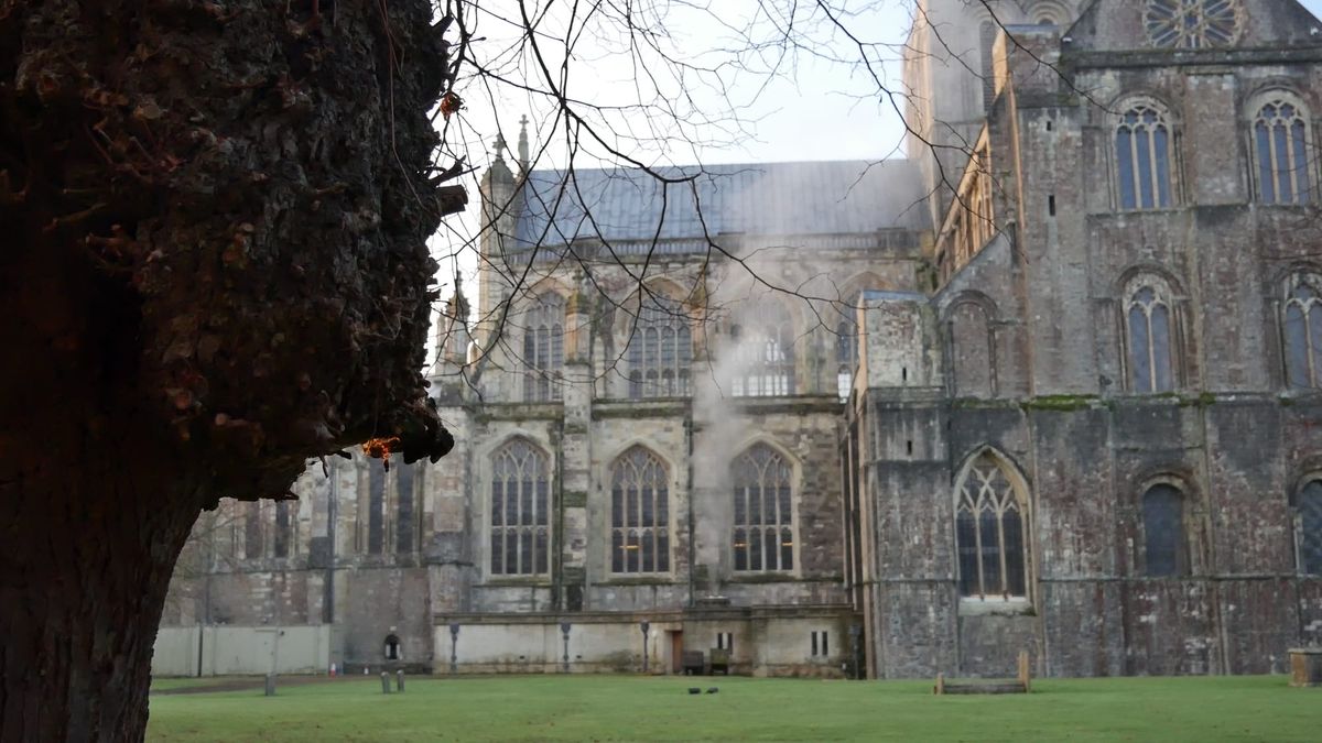
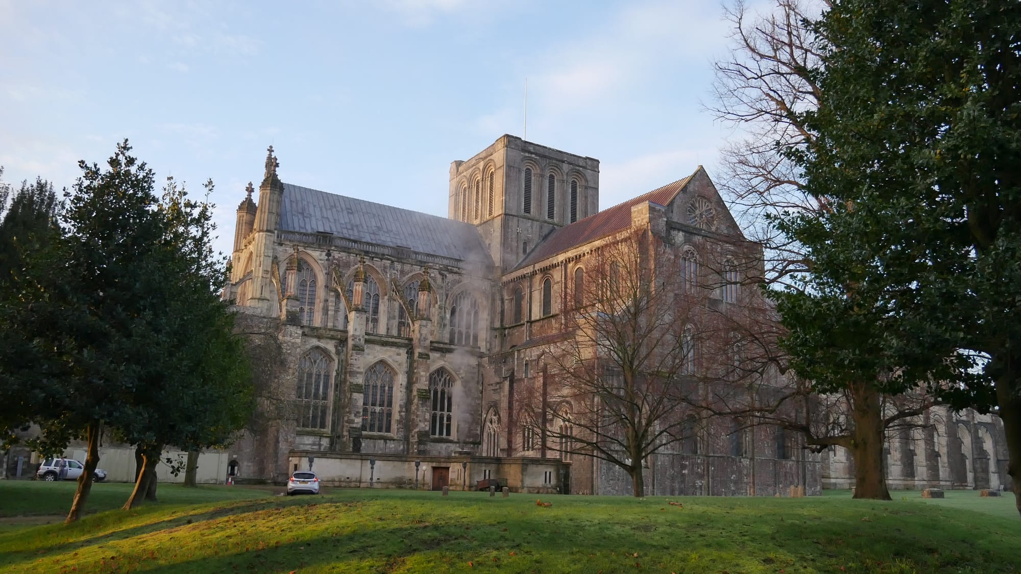
I love a good wander around Winchester, camera in hand, keeping my attention wide to find the perfect photo, or video footage. A few days back I spent a day wandering Winchester making a short film about why design matters. It's a good city for it.
You step out of a modern coffee shop interior, in an old building structure, straight onto a medieval street that was, likely, designed to funnel people in, out and around the cathedral, for the better part of a thousand years.
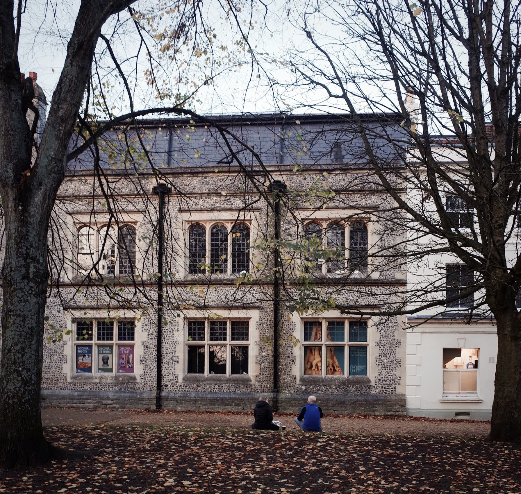
The Buttercross sits in the high street – a common meeting point and place to hang out with your coffee and sausage roll. Pigeons flock around the crumbs as people sit on the worn stone steps around it.
Winchester is, among other things, a very fine place to study design – specifically around ordinary life – and most of that design you never actually notice. Not unless you choose to pay attention to it. This is, I suggest, a key point about design, and the thing most of us get slightly wrong about it.
When we hear the word, we tend to picture surfaces – cars, buildings, packaging, the beautiful visible things that signal taste and craft and simplicity and form. In business it's the same: design usually means the product, the interface, the customer experience, the customer journey, the packaging. How it looks. How it feels. Whether people like it. All of which matters, genuinely. But it's only half the picture, and maybe, the more important half is the other one. Because as Steve Jobs put it, design is not just what it looks like and feels like — design is how it works. And how our work works is designed too, whether anyone ever sat down and designed it or not.
That's worth sitting with for a minute. Every process in your organisation is designed. Work moves in certain directions; decisions get made at certain points; the approvals and hand-offs and delays and rework all exist because somebody, at some point, built a system that let them exist – or never quite got round to building one that didn't. The absence of deliberate design isn't the absence of design. It's simply design by neglect, and it reliably produces worse results. Or, as Brian Reed put it rather more neatly: everything is designed. Very few things are designed well.
It's remarkable really that organisations happily spend money hiring designers to craft the product, the customer experience, the brand – and often leave the design of how the actual work gets done almost entirely to chance. The result is a pattern so common it's rarely pointed at: good, capable people working hard inside badly designed systems that defeat them.
I have a small collection of stories of my own. I once applied for a role that took six months to come back to me – during which, it emerged, I'd been the successful candidate the whole time; nobody had designed a step where someone actually told me. At one company it took three weeks to provision a laptop for a job that needed one on the first morning. At another, the induction was so thoroughly absent that my new manager didn't know I was arriving, and I was politely sent home at ten o'clock. None of these were people problems. Every one was a design problem – a system somebody built, or allowed, that produced precisely that outcome.
So here's a good, rather uncomfortable test.
If your customers could see how the valuable thing they're paying for actually gets done inside your business – the meetings, the hand-offs, the waiting, the rework, the politics, the approvals, the flow, the way an idea makes its way toward something valuable – what would they say? Would they be impressed by the clarity, alignment, good spirits, smoothness and the momentum? Or somewhat appalled by the confusion, the queuing, the steps that serve no one, the disengagement and the sheer amount of energy being burned by the system rather than spent on the work?
Because internal design always leaks outward in the end. It surfaces as missed dates, uneven quality, creeping cost – the friction a customer feels without ever seeing its cause. Joel Spolsky put the standard beautifully: good design adds value faster than it adds cost. The inverse – design that adds cost faster than value – is the tax a great many organisations pay without ever quite noticing.

The good news, and it genuinely is good news, is that good process design is rarely about elegance or cleverness. The best-designed processes are almost always the simplest – simple enough to explain in a sentence, simple enough to improve, simple enough that you can see the exact place they break. You could likely explain them to a child, and the child would understand.
Alina Wheeler called design "intelligence made visible," and that's the test worth applying: ask the people inside your business whether the way work flows is simple, logical and easy to navigate, and if they can't quite bring themselves to say yes, then the intelligence maybe isn't visible yet. It's buried under legacy rules, competing goals, politics, overly restraining processes and accumulated complexity that nobody was ever really given permission to question.
Simplicity like that is hard-won. It means carefully facing down silos, departmental borders, political habit, and rules that outlived their stay years ago. It means choosing flow over control, learning over blame, and improvement over the comfortable inertia of "how we've always done it." Deming's rhythm helps — Plan, Do, Study, Adapt: settle the purpose, pick a measure, run a small experiment, improve, and go again. Not once, but as a habit. Winchester wasn't designed well in a single afternoon either. It was tended, patiently, for centuries.
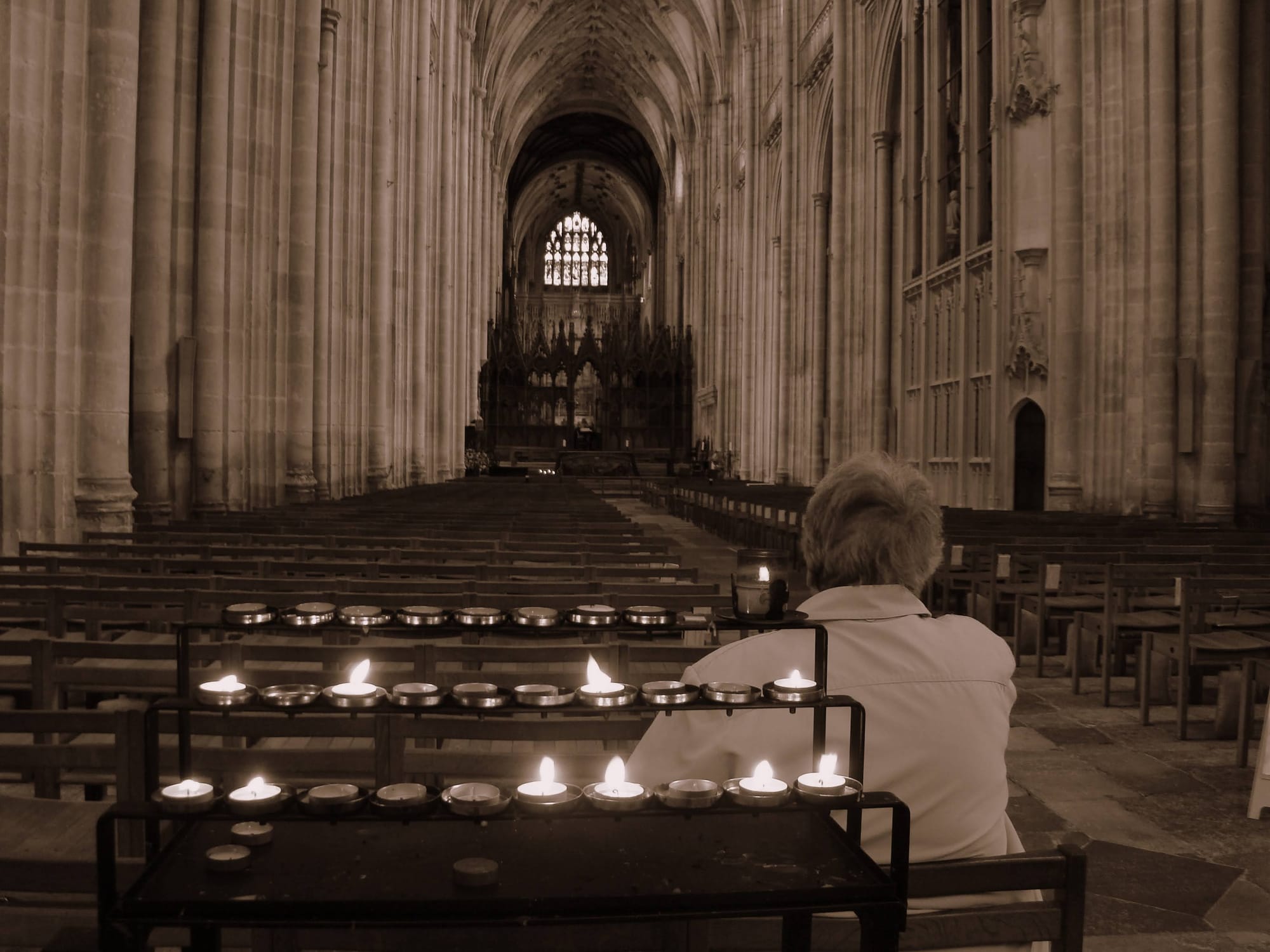
It's about here where design stops being an aesthetic wonder tool and becomes the game at work – because design is how ideas become value. Every organisation exists to move ideas into value: to take what it could do and turn it into something real that reaches people. The distance between the idea and the value, and all the friction that gathers along the way, is very nearly all decided by how the work, and communication, is designed. The fastest way to see your own design honestly is to staple yourself to pieces of work and follow them from one end to the other, mapping what actually happens rather than what the process map claims. It's usually a revelation. There may even be tears at the complexity added to what should be a straight forward flow of value. Flows that look good from the outside often turn out to be full of hidden problems the moment you travel along them from within.
And the levers that create all of this – the goals, the budgets, the rules, the incentives, the shape of the business – are more within reach than they look, and often held together by more people than we tend to believe. Pull them deliberately, with design in mind, and you change what's possible for everyone involved. Because good people inside a badly designed system will always struggle, and the system will limit what they can do far more surely than their talent or effort ever could. Which is a daily waste of exactly the things least worth wasting – their time, energy and attention.
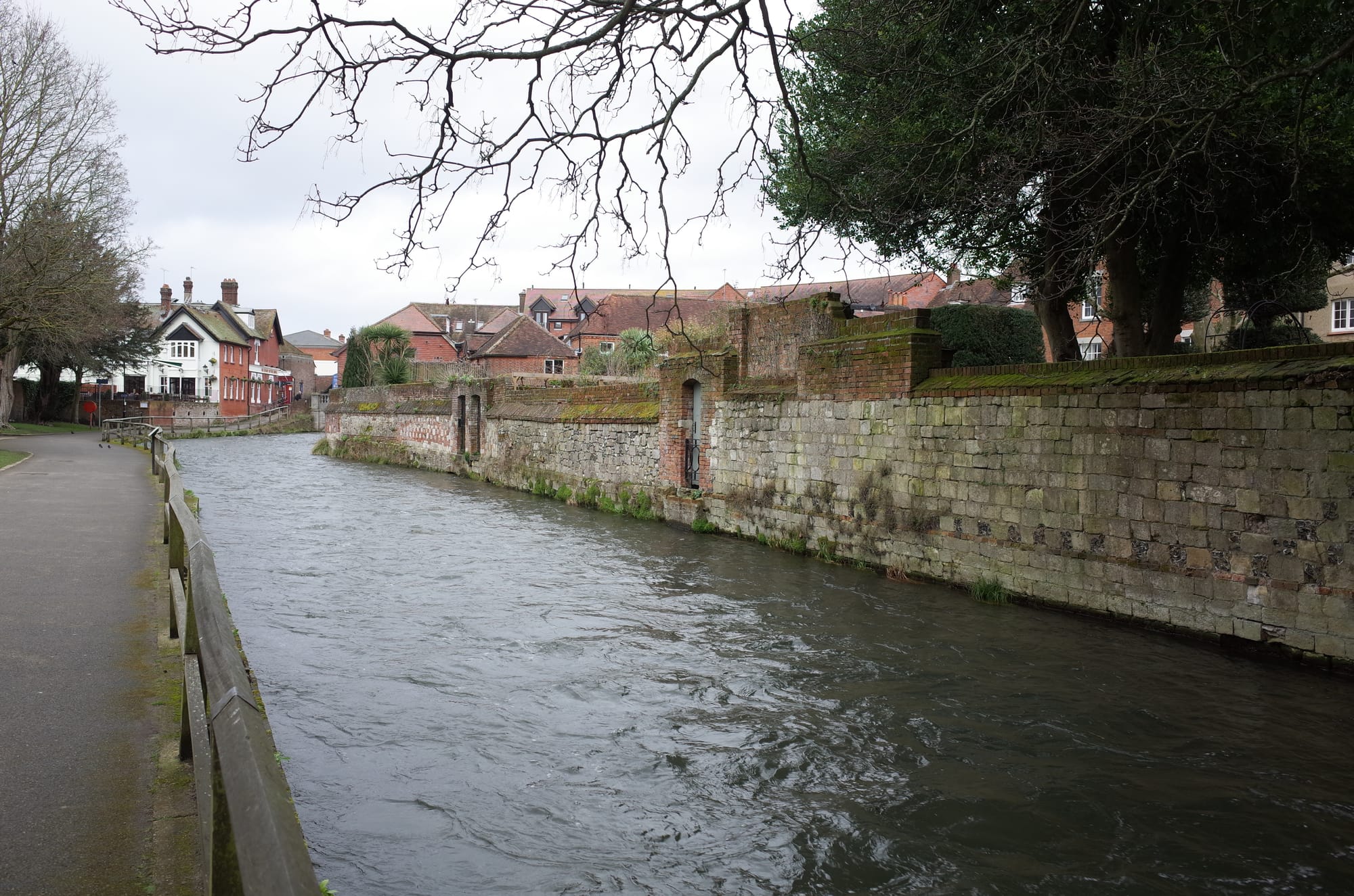
Design, then, is not just what our outputs look like. Design is how work works. And the encouraging part – the reason this is a hopeful piece and not a hopeless one – is that when it works well, when the path from idea to value is clear and smooth and improved a little each week, everything else gets easier: the people, the customers, the results, the mood in the office, everything.
Winchester is a joy to walk through because, over centuries, enough people cared how it worked and not merely how it looked. A business is no different. It's all designed already. The only real question is whether you're the one doing the designing.
Where this sits in the Atlas
Orientation·Idea to Value·Communication·Creativity & Climate·Learning