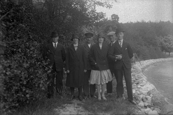
The Architecture of Clarity
I thought I was researching old printing presses. Instead I found myself studying operating systems. A journey through the archives of the GPO, Braun, Lufthansa and the BBC — and what they were really building beneath the surface.

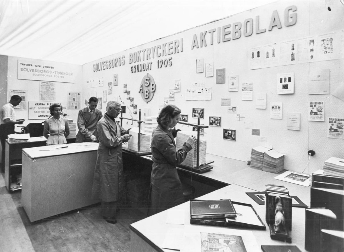
What I learned in the archives of the General Post Office.
I thought I was researching old printing presses.
It began innocently enough. I had stumbled across the archives of the General Post Office, more specifically – the wonderful picturing the big shop book – and expected to spend an afternoon admiring beautiful typography and the machinery of a vanished age. There is something endlessly satisfying about watching skilled people make physical things well, and I assumed that would be the extent of my fascination.
Instead, I found myself studying operating systems.
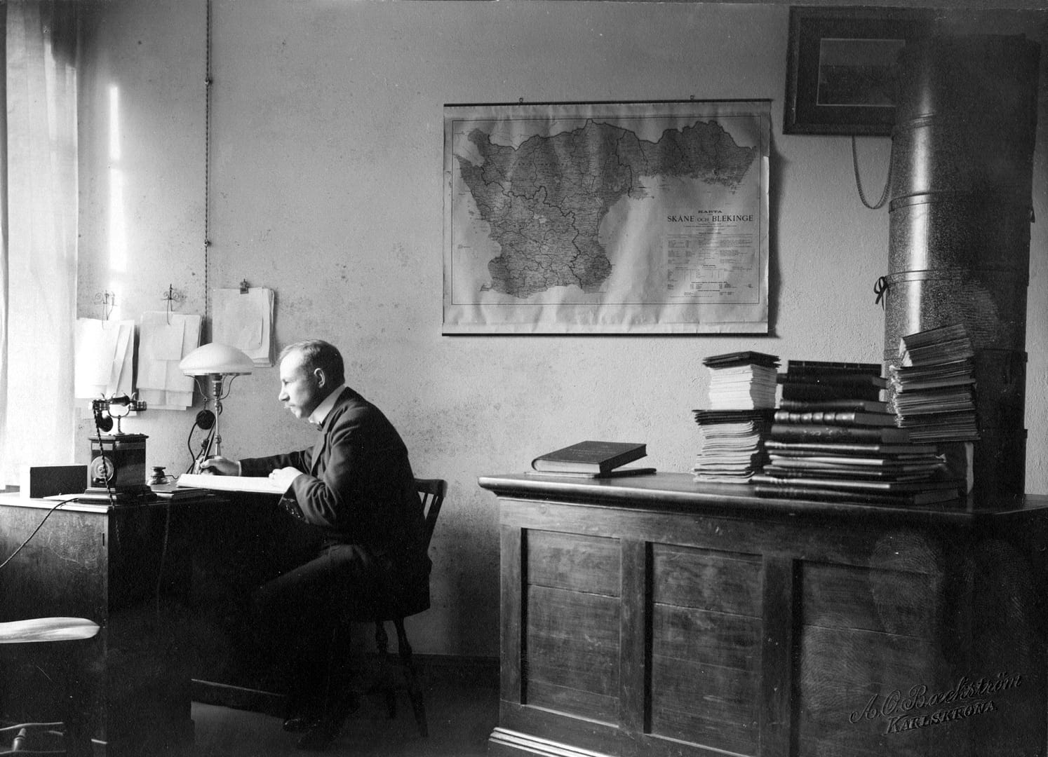
Not what I expected to find
The deeper I travelled into the archives, the less interested I became in the objects themselves. It wasn't the posters that held my attention, or the forms, or even the remarkable quality of the printing. It was the invisible machinery behind them: the manuals, the production standards, the editorial notes, the style guides, the environments they worked in and the workflows that allowed thousands of people to produce work that felt unmistakably coherent.
One archive led to another. The General Post Office became Braun. Braun became Lufthansa. Lufthansa became the BBC. The BBC became the editorial departments of newspapers and publishing houses. Although they belonged to different industries and different decades, they all seemed to be wrestling with the same question.
How do thousands of people create work that feels as though it came from one thoughtful mind?
That isn't a design question or a branding question. It is an organisational question.
Looking at the artefacts
The rabbit hole begins with beautiful things. A perfectly typeset government document. A Braun instruction manual where every photograph, every heading and every margin seems to occupy exactly the right place. An airline ticket from the 1970s whose typography felt overly designed, in a good way. An old railway operating manual where even the numbering system was a masterclass in simplicity and understanding.
It quickly went all over to design style guides, brand guidelines and tone of voice guides (there's a tone of voice article for leaders and managers here.)

These objects are captivating because they appear effortless. They possess a calmness that feels increasingly rare.
At first glance it is tempting to conclude that this is simply good graphic design. But stay a little longer. Look at enough examples and something begins to feel odd. They're all different, yet they somehow belong to the same family.
That is your first clue that you aren't looking at isolated pieces of work. You're looking at the output of a system.
Seeing the system
Once you notice it, you cannot unsee it.
Behind every beautiful document is a decision that was made long before anyone sat down to create it. Someone decided which typeface would be used. Someone decided how diagrams should be drawn. Someone decided how technical information should be explained. Someone decided how titles should be written, how photographs should be cropped, how reports should be structured and how information should flow from one page to the next.
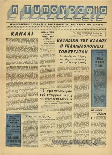
None of these decisions existed to make things look attractive. They existed to remove unnecessary decisions from everyone else.
The manual was not there to constrain creativity. It was there to preserve clarity.
The more I explored, the more these documents began to resemble something entirely different. Not style guides. Operating systems.
What a style guide is really doing
The most visible form of this architecture is the style guide. Companies that take design seriously inevitably codify it — not because they want to constrain their designers, but because they want to preserve the accumulated judgement that took years to develop.
A style guide is a memory system. It holds what an organisation has learned about clarity so that new people can inherit it rather than rediscover it. It is why a Braun product manufactured in 1975 still looks similar to a Braun product manufactured in 2005. It is why a BBC news bulletin from any decade of the corporation's history is recognisable as BBC. It is why the New York Times of today feels continuous with the New York Times of a century ago.
The style guide is not the point. The style guide is the visible tip of something much larger — an organisation that has decided its accumulated understanding is worth preserving. Most organisations don't decide this. Most organisations let their understanding walk out of the building every time someone leaves.
Digging deeper
Eventually the manuals disappear altogether. What remains is philosophy.
The organisations that fascinated me most all appeared to share an unusually simple belief. They believed that clarity was too important to leave to chance.
That sounds almost obvious until you compare it with the modern workplace.
Today we possess extraordinary communication tools. We have instant messaging, collaborative documents, AI assistants, knowledge bases and video conferencing. Information has never travelled faster.
Yet clarity often feels more elusive than ever. Meetings generate more meetings. Documents multiply without increasing understanding. Projects falter, not because people disagree, but because they interpret the same words differently.
The problem isn't just communication. The problem is architecture. We've become exceptionally good at moving information while investing remarkably little thought into the structures that give information meaning.
We've digitised the pipes without redesigning the plumbing.
The architecture beneath communication
Communication is what we see. Architecture is what makes communication work.
When an organisation explains itself well, we tend to praise the presenter, the writer or the designer. But those people rarely work alone. Behind them sits an invisible architecture — shared language, editorial judgement, meeting rhythms, decision-making principles, templates, review processes, design standards, teaching, apprenticeship, and a common understanding of what "good" looks like.
These things rarely appear in strategy documents, yet they quietly shape everything else.
The most effective organisations don't simply communicate better. They reduce the need for communication because so much understanding is already shared. The clarity is already inside the room. Nobody needs to argue for it.
Why this matters
The rabbit hole changed how I think about organisations.
I used to think that communication happened after the work. Someone has an idea, the team builds something, marketing explains it, leadership presents it, documentation catches up.
But perhaps communication isn't the final step at all. Perhaps it is the environment within which every other step takes place.
If the environment is confusing, every idea has to fight its way into existence. If the environment is clear, ideas travel further with less effort. The difference isn't talent. It's friction.
The organisations I found myself admiring had spent decades removing friction from the journey between intention and understanding. That may be the quiet genius hidden inside all those old manuals.
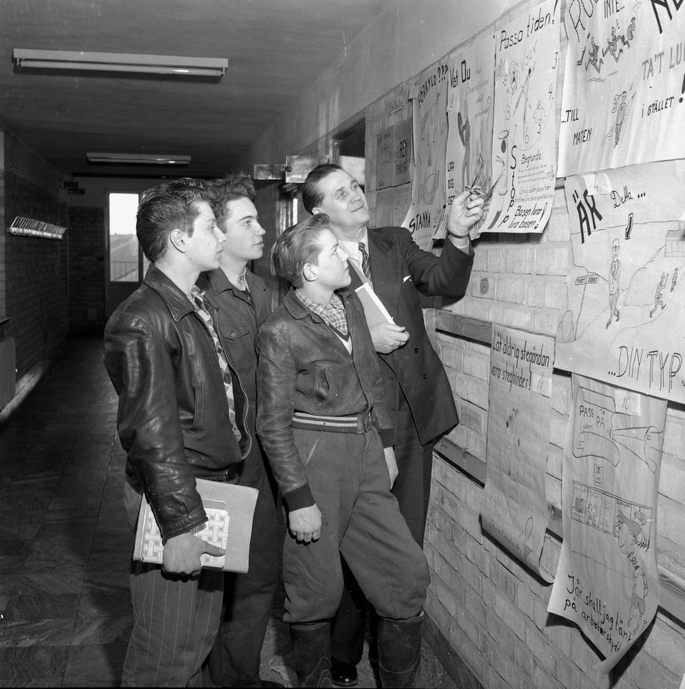
What they were really building
Looking back, I no longer think the General Post Office was primarily producing printed material. Braun wasn't simply manufacturing radios. The BBC wasn't merely making programmes.
Each was engaged in something much more ambitious. They were building environments where clarity could emerge consistently. Not through heroic individuals. Through carefully designed systems.
That changes the way I think about leadership as well. Perhaps the leader's task is not to communicate brilliantly alone. Perhaps it is to build an architecture in which brilliant communication becomes the natural outcome.
After all, clarity leads to alignment, alignment leads to momentum and momentum leads to value.
The invisible cathedral
I live in Winchester and regularly wander around the magnificient Cathedral we have here. Often taking time to sit with a coffee and truly look at it, to study it and to wonder how it got built and how it survived this long.
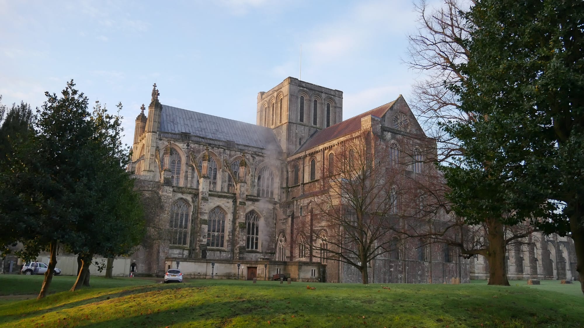
We inherit cathedrals because people cared enough to draw plans before they laid stones. We admire the finished building, but its beauty depended upon countless invisible decisions made long before anyone lifted a hammer.
Organisations are no different. The products receive the applause. The presentations receive the attention. The campaigns win the awards. But beneath them sits an architecture that almost nobody notices — a vocabulary, a handbook, a meeting rhythm, an editorial principle, a shared way of seeing.
These are not administrative details. They are the foundations upon which everything else is built.
Perhaps the most valuable artefacts an organisation creates are not the products it sells, but the documents, principles and practices that teach people how to create those products well.
The architecture of clarity is rarely visible. But once you've seen it, you begin to recognise it everywhere. And once you recognise it, you realise that the real masterpiece was never the poster, the radio or the annual report.
It was the invisible system that made them all possible.